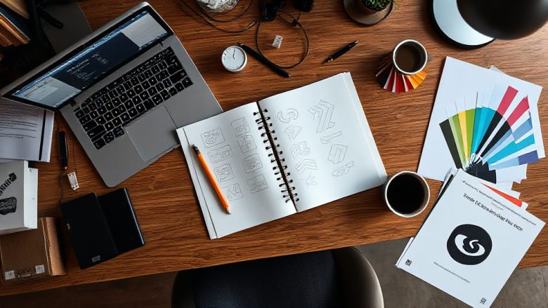
You’ve spent hours pushing shapes around a canvas. The client is waiting. You export the file, send it off, and then a small voice says: something feels off. Maybe the mark looks cramped at small sizes. Maybe the colours fight each other. Maybe it just doesn’t look like a logo yet.
That feeling is normal, and it’s useful. It means your eye is ahead of your hands. This checklist covers the seven mistakes that trip up almost every first-time logo designer, with a concrete fix for each one. Work through them in order before you finalise anything. Most of these logo design tips for beginners take five minutes to apply and save you a painful revision round later.
1. You designed for the screen in front of you, not for the real world
Beginners almost always design at one size. The logo looks great at 800 pixels wide on a bright monitor, so it gets approved. Then it appears as a 32-pixel favicon, on a black van door, and stitched onto a polo shirt, and it falls apart.
Fix this by testing at the sizes and surfaces the logo will actually live on before you show anyone. Shrink your artwork to 24 pixels wide and look at it on screen. If the icon becomes an unreadable smudge, simplify. Print it in pure black and white on paper. If it loses meaning without colour, the shape isn’t doing enough work. Put it on a mockup of a dark background and a light background. If it disappears on either, you need an outline, a counter-shape, or a second version.
The practical rule: if the logo only works in one context, it isn’t finished. Build the small version first, then scale up. It’s much easier to add detail than to remove it.
2. You’re relying on colour to carry the whole design
Colour is the easiest thing to change and the hardest thing to get right. New designers often pick colours because they look nice together in a palette tool, then discover the combination collapses in greyscale or clashes with the client’s existing materials.
Start in black and white. Always. Get the shape, weight, and spacing working with no colour at all. If the logo reads clearly as a black mark, colour becomes a bonus rather than a crutch. When you do add it, limit yourself to two colours plus a neutral. More than that and the mark starts to feel busy at small sizes.
Check contrast properly too. A mid-blue on a mid-grey looks fine on your calibrated screen and turns to mush on a phone in daylight. If two colours sit next to each other in the logo, make sure one is clearly lighter or darker than the other. And pick colours from something real: the client’s existing signage, packaging, or photography. Borrowing from their world beats inventing a palette from scratch.
3. Your typography is doing too many different jobs
Three fonts in one logo is a warning sign. Four is a problem. Beginners often try to make a wordmark feel ‘designed’ by mixing a script, a serif, and a geometric sans, and the result reads as noise.
Pick one typeface for the main name and, if you genuinely need it, a second for a tagline or descriptor. That’s it. If you want variety, get it from weight, spacing, and case rather than from a new font. A single family used at two weights will almost always look more considered than two unrelated families.
Watch the spacing as carefully as the letterforms. Beginners set type too tight because it looks punchy at large sizes, then the letters touch when the logo shrinks. Add a little tracking, especially on all-caps wordmarks. And check the kerning on pairs like ‘AV’, ‘TA’, and ‘ry’ by eye, not by trusting the default. Small optical adjustments are what separate a logo that looks professional from one that looks almost right.
4. You skipped the research and designed from your own taste
This is the mistake that causes the most rework. You open the software, start sketching, and build something you personally like. The client wanted something that feels trustworthy and traditional, and you’ve delivered something playful and modern.
Before you draw anything, spend twenty minutes gathering references in the client’s category. Not to copy them, but to see what visual language already exists. If every competitor uses a blue circle, you have two choices: match it so you feel familiar, or deliberately break from it so you stand out. Both are valid. What isn’t valid is not knowing which one you’re doing.
Write down three adjectives the logo should communicate and three it should avoid. Keep that list next to you while you work. When you’re stuck between two options, the list decides. This single habit will improve your work more than any software trick.
5. The mark is too literal or too abstract
Beginners swing between two extremes. Either the logo is a literal illustration of what the business does, or it’s an abstract shape with no connection to anything.
A literal approach fails because it dates fast and describes rather than suggests. If you run a coffee shop, a detailed drawing of a cup says nothing a customer didn’t already know. A more abstract mark leaves room for the brand to grow and feels less like clip art.
The fix is to find one distinctive detail and build the mark around it. Not the whole object, just the part that’s recognisable. The curve of a cup handle. The angle of a roof. The gap between two letters. Reduce until removing anything else would break the idea. Then stop.
A useful test: cover the company name and show the mark to someone for three seconds. If they can’t describe what they saw, it’s too complex. If they describe it but can’t remember it a minute later, it’s too generic. Aim for the middle.
6. Your file setup will cause problems later
This is the least glamorous mistake and the one that causes the most client frustration. You deliver a single flattened PNG and call it done. Six months later the client needs a vector version for a sign, and nobody can find one.
Set up your files properly from the start. Keep a master vector file with editable text, and a set of exported versions: a full-colour logo, a one-colour version, a stacked layout, a horizontal layout, and an icon-only mark. Name the files clearly so anyone can find the right one without asking.
Use a sensible canvas size with the artwork centred and a consistent margin around it. Don’t leave stray points, hidden layers, or unused swatches in the master file. If you ever hand the work to another designer, they should be able to open it and understand it immediately. Treat file hygiene as part of the design, not an afterthought.
7. You’re presenting too many options and defending all of them
New designers often show eight or ten concepts, hoping one lands. It feels generous. In practice it overwhelms the client and makes you look unsure. Worse, the client picks the weakest option because it reminds them of something, and you’re stuck refining it.
Show three strong directions, each with a short written rationale explaining what it communicates and why. Present them in context: on a sign, on a business card, on a phone screen. Give the client a clear recommendation. You’re the designer; they’re paying for your judgement, not just your output.
When feedback comes back, separate taste from function. ‘I don’t like the green’ is taste, and it’s easy to change. ‘It’s hard to read on the invoice’ is function, and it matters more. Address function first, then negotiate taste. Keep a record of what was agreed at each stage so you’re not relitigating decisions three weeks later.
When to break the rules
Every point above is a default, not a law. There are times to ignore all of them.
If the brand is deliberately loud and chaotic, a busy mark with four colours might be exactly right. If the client is an artist or a musician, a hand-drawn, imperfect wordmark can carry more meaning than a clean geometric one. If the logo will only ever appear at large scale, on a building or a stage backdrop, you can afford detail that would fail as a favicon.
The point of learning the rules is to know what you’re giving up when you break them. A beginner breaks them by accident. A designer breaks them on purpose, and can explain why the trade-off is worth it.
So before you send that file, run the checklist. Shrink it. Grey it out. Print it. Read the type at arm’s length. Ask whether the mark still says something when the colour is gone and the name is hidden. If it does, you’re done. If it doesn’t, you now know exactly which of the seven mistakes to fix, and that’s a much better place to be than staring at a canvas wondering what feels off.